Note: This article is a machine translation from the original Japanese post. If you notice any translation issues, please let us know.
TV anime production studios struggle daily to create appealing works under tight budgets and schedules. Given these many constraints, is rigorous color management truly necessary?
This article examines the evolution of color management from the cel animation era to modern digital anime, and considers its importance.
Note: While extensive research was conducted through documents and interviews, the author is not a color management specialist. If you find any errors, please contact us at @loppo_gazai or mail@loppo.co.jp.
Was Color Managed During the Cel Animation Era?
Before the widespread adoption of digital technology, the concept of color management in animation production was not as clearly defined as it is today.
From cel paints to film to television receivers, every tool and piece of equipment had quality variations. Production structures were also smaller in scale compared to today. Because of this, building a consistent viewing experience was no easy feat, and this "difficulty of color reproduction" was widely understood among the staff involved in color design.
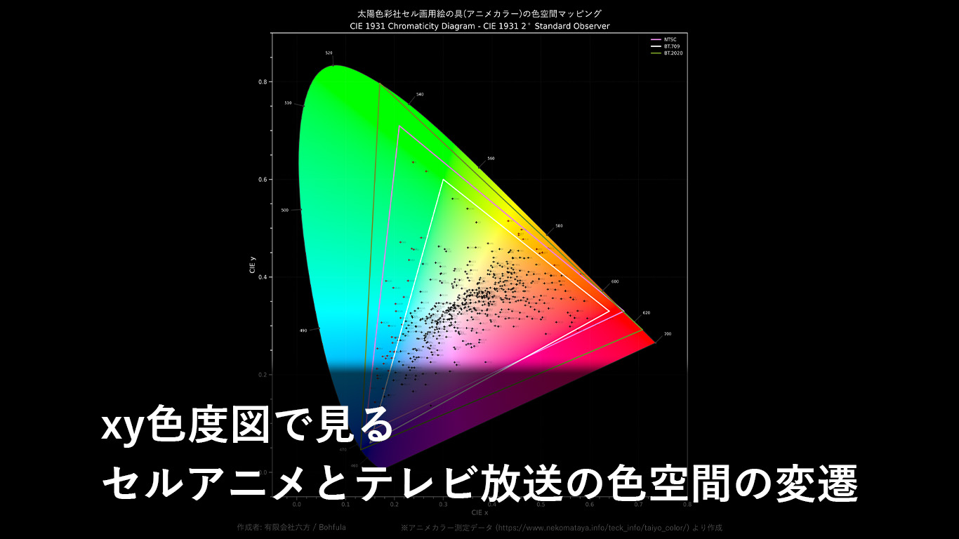
At the time, TV anime was produced using a technique called "cel painting," where colors were applied to transparent cels using specialized paints. The colors painted at this stage were noticeably different from those seen when actually broadcast on television -- overall much more vivid.
Related article: The Evolution of Color Spaces in Cel Animation and TV Broadcasting as Seen on the xy Chromaticity Diagram
There were various reasons why the paint colors and broadcast colors differed, but the key point here is that staff clearly recognized that colors would change.
If color design were done based solely on the paint colors at hand without anticipating how colors would appear during broadcast, the show would air in colors that bore little resemblance to the intended design. Therefore, the color transformation was factored in, and meticulous color design was carried out during the pre-production process. Various approaches were taken to maintain color consistency and quality, including managing the paint and film manufacturers and even their production lots.
In this way, during the cel animation era, there was an awareness of the difficulty of color reproduction on the production floor, and various efforts were made to deliver colors as close as possible to the intended design to viewers.
Digitization of the Coloring Process and Color Reproduction
When post-finishing processes were computerized, it became a problem that colors specified in RGB on monitors differed from colors seen in television broadcasts. However, within the tight production budgets and schedules of TV anime, few finishing studios were able to tackle this problem head-on.
For some TV anime that had sufficient preparation time, the RGB color palettes were prepared after conducting repeated investigations into how colors changed through compositing and other processes, taking those color shifts into account. For example, in Pokemon and Inuyasha[1], extremely thorough color shift investigations were carried out, focusing on the signature colors used for characters. Thanks to the efforts of all involved, these programs achieved a nearly seamless transition from cel animation to digital coloring.
However, this was still color reproduction based on matching to existing paint colors as "color references," and there was no way to predict how newly designed colors would appear to viewers.
Color Consistency Lost Along with the Cut Bag
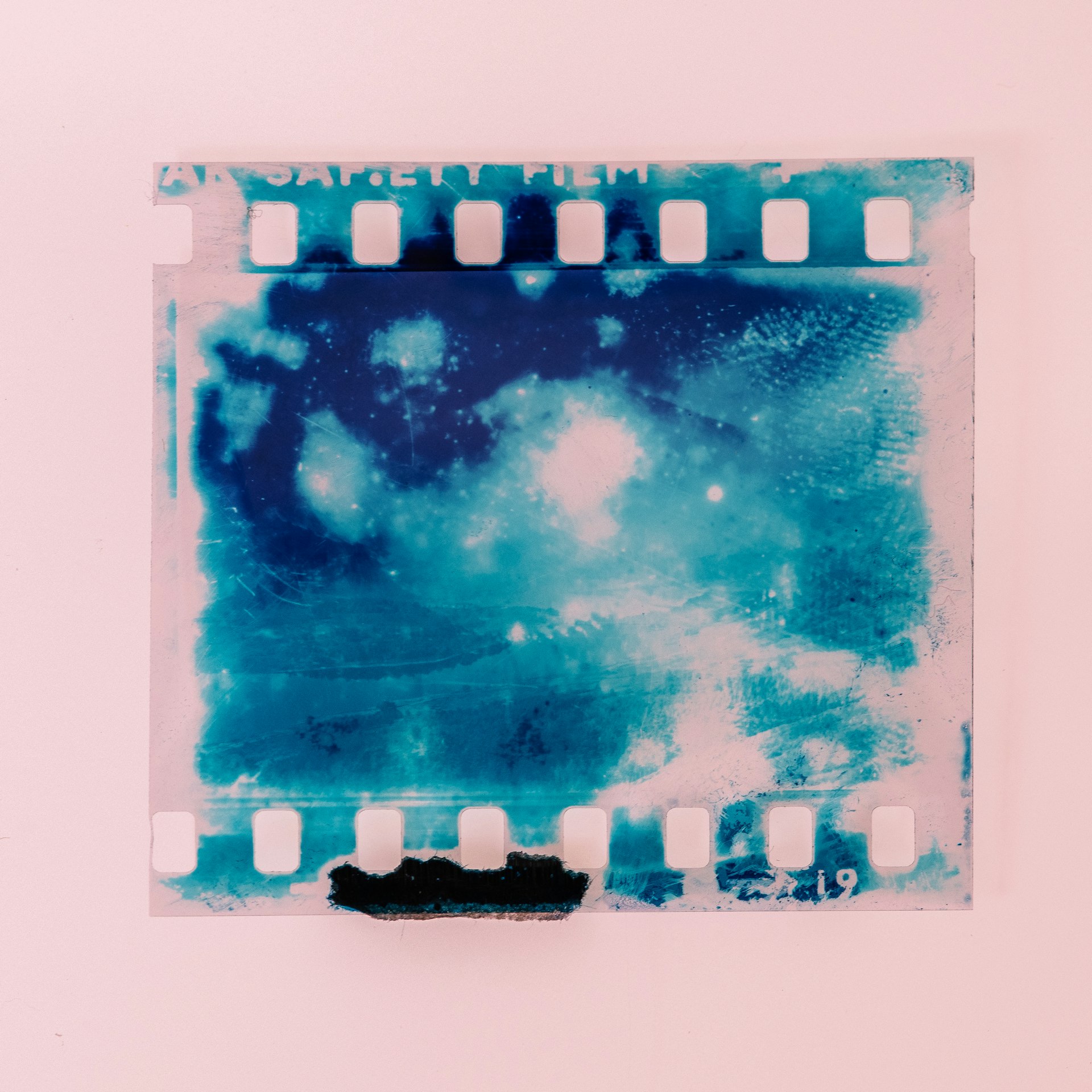
With the transition from cel animation to digital coloring, cels were removed from the cut bags, and intermediate materials from the coloring process onward came to be managed as digital data.
Previously, any staff member could visually and unambiguously identify the color of a cel simply by looking at it in the cut bag. The cel paint colors served as an absolute color reference on the production floor. (While the appearance of colors differs depending on lighting or individual color perception, at least the physical colors were consistent.)
With digital coloring, physical color no longer exists. Since everything is managed as discrete RGB values, how colors appear depends on the device (monitor).
To put this in terms of the production staff's perspective, it means "there is no guarantee that the color you specified will look the same to staff in subsequent processes." This is a fundamental difference from before and after the digitization of coloring.
Some production studios ensured a shared understanding of color among staff by introducing master monitors[2], but for many production studios, introducing expensive equipment was difficult, and they ended up abandoning consistency in color appearance. As time passed since the digital transition, it became commonplace -- except at well-funded major studios or for theatrical productions -- that color appearance consistency was not guaranteed even among staff at the same production studio.
The Finishing Process in Anime That Requires No Color Management
As a slight digression, when it comes to how problematic abandoning color management really is, in the anime finishing process, it actually does not cause critical issues in many cases.
Japan's finishing process has historically been organized to allow home-based work, partly due to historical circumstances such as its expansion as piecework for housewives during the period of rapid economic growth.
Paints procured in advance by the finishing company were delivered by production assistants along with cut bags by car to the studios or homes of finishing staff. Finishing staff could paint consistent colors using only the color code numbers, based on the provided paints and color specification sheets. No color sense was required, and there was no need for uniform brushes or lighting.
This principle carried over even with digital coloring. Color designers and color specification staff create color palettes for each scene and distribute them as color specification sheets. Finishing staff use the eyedropper tool to pick up RGB values from those image files and paint with the paint bucket tool.
When color specifications are not ready in time due to major schedule delays, or when differences between normal and shadow colors are hard to distinguish due to monitor issues, temporary colors (arbitrary RGB values) may be painted and later batch-replaced with the correct specified colors. With this method, even if the finishing staff's monitor displays incorrect colors, the work itself can proceed without problems.
Therefore, there is an opinion that color management or color reproduction is unnecessary, at least in the finishing process. As long as the work adheres to anime's traditional conventions of highlight, normal, and shadow, this argument holds true.
By clearly separating the roles of the person who designs colors, the person who paints, and the person who inspects, this is an excellent example of division of labor and efficiency -- making color management unnecessary in a process that deals with color.
Who Designs the Viewing Experience: When Digital Color Management Is Completely Abandoned
Ultimately, it is the animators who design the viewing experience of an animation. However, in today's highly specialized commercial animation, this responsibility is shared among numerous staff members.
Focusing on the color-related aspects, the art director and color designer are the central figures. What happens when digital color management is completely abandoned in these processes?
The color designer creates RGB color specification sheets using their PC monitor, based on their excellent color sense. Even when these specification sheets are distributed to other staff, no one can perceive the same colors. This is because no color profile is embedded in the specification sheets, and no one's monitor is color-calibrated.
The designed colors cannot be shared not only with viewers, but even with other staff members. In this situation, a shared understanding of color specifications cannot be established, so when other staff or monitors are used to specify colors, the results may not align with the color designer's intent. That said, since extreme things like red turning blue or green turning purple do not happen, everyone proceeds with their work trusting their own monitor environment.
Eventually, the digital materials reach the compositing staff. The compositing team must work without any way of knowing whether these materials are in the colors actually specified by the color designer and color specifier.
However, through preliminary meetings during the pre-production process, the director of photography should have been able to align somewhat with the director, episode director, art director, and color designer on the completed image of the work. Based on this, the compositing team synthesizes and corrects the footage to achieve the intended viewing experience.
Surely the compositing staff's monitors are not completely uncalibrated, so at this point, the colors that will ultimately be broadcast are finally determined. (If, by some chance, the compositing staff's monitors have no color management at all, the broadcast master would be produced without anyone knowing the accurate colors until actual broadcast.)
The director checks the master before broadcast, but if they are not using a master monitor, what they see differs from what the compositing team saw. Since viewers will just watch on their small smartphone screens in dark rooms with brightness maxed out, they give up on checking color accuracy. Viewers watch the anime in their own various environments, fully believing that the colors are as designed.
After the show airs, Blu-ray discs are to be released. If truly nothing has been managed, the broadcast master is simply burned onto discs as-is. The anime BD ends up containing 60i footage.
Even if it is not quite that careless, authoring is done from 24p source material, but for some reason a reddish tint appears. Even during the director's final check before pressing, the evaluation monitor's color is wrong, so the reddish tint goes unnoticed and the disc ships, drawing complaints from fans.
By not managing color, footage that does not match the intentions of the director and color designer ends up being broadcast. While this was a somewhat extreme example, it appears to be something that actually happens at a considerable number of production studios.
Can Color Management Truly Deliver the Intended Viewing Experience?
So, can introducing proper color management prevent the tragedies described above?
First, it enables proper sharing of colors designed by each staff member. This is invariably cited as a benefit of color management. Key staff members can see the same colors and make appropriate decisions. By communicating the information necessary for color management to the BD authoring staff, proper color handling can be expected even outside the production studio.
But what about the final viewer's experience? In the earlier example, the viewer was watching "on a small smartphone screen in a dark room with brightness maxed out," but they might also be "watching on a large TV in a living room bathed in afternoon sun with their family." Is the viewing experience truly the same in both cases, as long as color management is in place? Both viewing environments differ significantly from the master monitor installed at the production studio. Moreover, even if these monitors have the performance for accurate color representation, the devices independently perform color expansion, often displaying images far more vividly than intended.
Unfortunately, the arbitrary behavior of viewing devices cannot be prevented by simply implementing a color management protocol. This problem runs very deep, and production organizations have repeatedly filed complaints with device manufacturers, but since it also stems from end consumers' preferences, it remains unresolved.
What can be done for now is to test on multiple devices (TVs, tablets, smartphones, etc.) during the pre-production process, checking how content appears in various viewing environments. Fortunately, with proper color management in place, remastering -- adding appropriate color adjustments for each device after the fact -- also becomes easier.
Is It Truly Worth the Significant Investment in Color Management?
Considering that TV anime is inexpensive entertainment, it is understandable that the benefits of investing a considerable amount in color management may not be apparent. After all, current anime expression was established through methods developed to produce content cheaply. Some may argue that color reproduction is unnecessary here, that only tonal gradation needs to be ensured, and that this is not art sophisticated enough to warrant rigorous color management.
In modern society where vast amounts of content circulate, if TV anime is nothing more than something consumed in an instant, one can understand the perspective of wanting to save limited budgets for producing more content. Furthermore, some may argue that the problems raised above stem from inadequate design during the pre-production process, and that color management is not the essential issue.
I would like to offer counterarguments to these opinions that are reluctant to adopt color management.
First, while manga serialization -- once the mainstream source material for anime -- was mostly monochrome or two-color printing, recent source materials are predominantly games or full-color web manga serializations where viewers already have a clear image of the colors. Using colors that differ from those expectations risks damaging the brand image.
Additionally, when the original character designs feature heavy stylization, a lack of color accuracy can make it difficult to distinguish between characters.
Furthermore, with the diversification of viewing devices, there is a growing demand for appropriate viewing experiences across various environments, which is difficult to achieve without color management.
The purpose of unifying the viewing experience is not merely to make visuals look attractive -- color is used as a powerful storytelling tool. Color conveys character emotions and scene atmosphere, and helps elicit emotional responses from viewers. When intended colors are not accurately reproduced, the nuances and emotional impact the story aims to convey may be diminished.
As for the cost of introducing color management, this is merely a short-term issue. Rather, the long-term damage caused by not introducing it is the greater loss. By introducing standardized color management, work environments can be unified across different companies, enabling partial automation and making it easier to build flexible cross-organizational support systems.
How to Take the First Step Toward Color Management
Most industry professionals are already aware of the importance of color management, but in TV anime, "competing on color" has been difficult, and most have simply given up. But how exactly can color management be introduced into a production environment with so many constraints?
There is no need to immediately build a wide-gamut, high-luminance color pipeline like BT.2020/BT.2100. That is an extremely high hurdle requiring highly specialized knowledge, and it is excessive quality for typical TV anime.
Instead, the director of photography should take the lead in sharing color management knowledge with all planning staff involved in the pre-production process, and gaining their understanding. This is because a color pipeline that the compositing team cannot handle is utterly meaningless.
Next, introduce the color pipeline to the art director, color designer, and color specification staff. The goal is to enable the key staff who make color decisions to design and inspect in the correct working color space. Initially, meeting the SDR reference monitor requirements described in the Netflix documentation mentioned below should be sufficient. While an expensive HDR reference monitor may be introduced, ensuring that the environment is consistently maintained through regular calibration is more important.
After introducing color management, establish color design documentation with clearly defined color profiles during the pre-production process. This documentation should be properly shared not only with the production team but with all IP managers including the production committee, and compliance with these decisions should be thoroughly communicated. This prevents color shifts during subsequent disc releases or remastering.
It is not necessary to impose color management on all staff. For staff who do not work with color, it would be an excessive equipment investment and a burden.
Rather, what is more important is clearly managing whether each production material comes from staff in a color-managed environment or not. For example, materials before color inspection can be treated as unmanaged materials, and after being checked by color-management-equipped inspectors, they are treated as managed materials.
By doing this, even if materials without color management reach the compositing team due to production schedule delays and confusion, the compositing team can be aware of this. This can serve as an important indicator for decisions such as whether to issue an R (retake).
As a reference for building a color workflow, the color management technical documentation provided by Netflix is helpful. In addition to being a valuable technical document written in Japanese, the global standards set by Netflix, a leading anime streaming platform, can serve as an important benchmark.
Conclusion
This article examined the importance of color management in TV anime production, tracing the evolution of color management from the cel animation era to digital coloring, with a focus on the difficulty of color reproduction and its solutions.
Due to technological advances and the diversification of viewing environments, the need for color management to maintain color consistency is growing daily, but its introduction faces difficulties under the tight budget and schedule constraints unique to TV anime.
At LOPPO, we are addressing this issue from both the perspectives of animation industry history and ICT technology. Most recently, we will have an exhibition related to this article at ACTF2024 in TAAF, held on March 10, 2024. While it is limited to industry professionals, please see the exhibition information below if you are interested.
Related article: Exhibition at Animation Creative Technology Forum (ACTF) 2024
Introducing an appropriate color pipeline is an important step toward improving the quality of anime works and providing viewers with the best viewing experience. By advancing understanding and adoption of this technology across the industry, the sustainability of anime production studios will be enhanced.
Footnotes
- LOPPO is planning to distribute a coloring interview article about this digital transition.
- Atsushi Okui, Studio Ghibli's Cinematography, BNN, Inc., 2023, p. 82.