Note: This article is a machine translation from the original Japanese post. If you notice any translation issues, please let us know.
In the latter half of the 20th century, a wide variety of paints were used for coloring in Japanese cel animation production studios. By analyzing these through modern color science, we can glimpse the depth of experience and knowledge possessed by the color design staff of that era.
Note: While I have conducted as thorough an investigation as possible through documents and interviews, I am not a color management specialist. If you find any errors, please contact us at @loppo_gazai or mail@loppo.co.jp.
The CIE xy Chromaticity Diagram: A World Map of Color
The CIE xy chromaticity diagram is a tool used to represent the visual characteristics of color, expressed in the CIE 1931 color space based on tristimulus values. Since "hue" and "saturation" are represented on a two-dimensional plane, it is extremely useful for visualizing the color gamut produced by specific light sources or colors.
That may sound complicated, so for now, just think of the CIE xy chromaticity diagram as a "map of color." Just as a world map can represent every location on Earth, the CIE xy chromaticity diagram can represent every color perceivable by the human eye.
Using Open Data from Anime Colors

Click the image to view at full size
In the finishing stage of cel animation, special paints that could be applied to transparent cels were used. Some may remember them by the name "Anime Color." In Japan, it is said that nearly all of this paint was supplied by two companies: Taiyo Shikisai and STAC. As the industrial demand for cel animation has disappeared, both companies have ceased production.
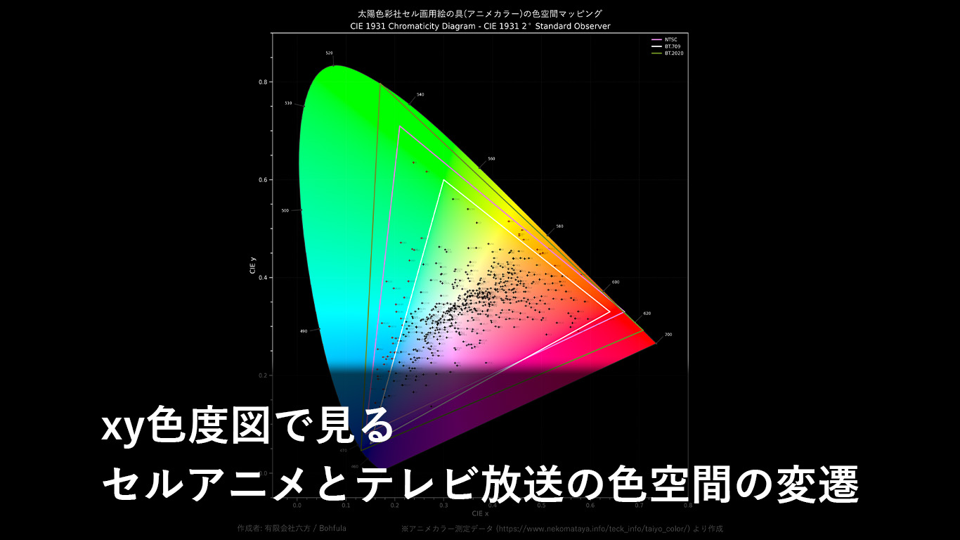
In 2003, while paint still remained at production studios, animator Norifumi Kiyozumi used a colorimeter to measure 573 colors from Taiyo Shikisai and published the data on the internet.
The CIE xy chromaticity diagram at the beginning of this article plots 567 Anime Color shades[1] in the CIE 1931 color space using this excellent open data.
While the paint colors would differ from their final broadcast appearance due to lot variations, photography processing, and film characteristics, we can still learn a great deal from this diagram.
Cel Animation Colors and Analog Broadcasting (NTSC Color Space)
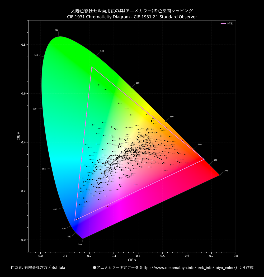
For example, when we overlay the NTSC-J color gamut (the purple triangle) used in Japanese analog television broadcasting, we can see that nearly all the colors fit neatly within its boundaries. This means that analog TV broadcasting had the potential to reproduce the colors of Anime Color paints[2].
Since the NTSC color space was not designed with paint color gamuts in mind, this is either a complete coincidence[3], or it is more reasonable to assume that the paints adapted to the broadcast signal.
This suggests that the color designers of that era had an empirical, intimate understanding of the TV broadcast color space. Predicting how the final broadcast anime would appear and selecting optimal colors within those constraints — while this may have felt natural to them, it is an astonishing skill when you think about it.
Transition to Digital Broadcasting (BT.709 Color Space)

As CRT televisions gave way to LCD TVs and terrestrial broadcasting shifted from analog to digital, the color space used for TV broadcasting changed to BT.709. BT.709 is very similar to the sRGB color space commonly used on the web and has a narrower color gamut compared to NTSC.
When the BT.709 color gamut (the white triangle) is overlaid on the CIE xy chromaticity diagram, a considerable number of colors fall outside the boundaries. Broadly speaking, colors that could previously be broadcast as distinct hues could no longer be expressed in digital broadcasting.
This change is thought to have caused some confusion in anime coloring. Color designers and photography staff needed to adapt to the colors expressible within the new color space, which may have caused temporary fluctuations in quality and changes in style.
Additionally, since the computerization of the coloring process advanced around the same time, this further compounded the color confusion. In the cel paint era, around 200 colors were specified by color swatch numbers, but with palettes storing 24-bit RGB values, the number of specifiable colors skyrocketed to 16 million (regardless of whether they displayed correctly on monitors).
The Start of 4K UHD Broadcasting (BT.2020 Color Space)

Today, the majority of TV monitors sold at electronics retailers feature 4K resolution. And it is not just resolution — expressive capabilities such as color gamut and brightness have also improved dramatically. The BT.2020 color space, used for 4K broadcasting and Ultra HD Blu-ray, can express an extremely wide color gamut[4].
Looking at the BT.2020 color space (the olive-colored triangle) on the CIE xy chromaticity diagram, we can see that all the paint colors once used in cel animation fit within its boundaries. While it should be noted that this is based on the specification, it means that modern technology can reproduce an even richer range of colors.
This technical background is likely one reason why classic cel anime works are increasingly being remastered in 4K HDR and released on disc. However, please note that faithfully reproducing the paint colors on a monitor would result in colors that differ from what the original color designers intended for the broadcast appearance.
For new anime productions, establishing a production environment based on this vast color gamut is expected to be extremely challenging. This is because color management in the HDR era is highly specialized, and moreover, TV anime effectively abandoned color management in pre-photography stages when adapting to the digital broadcast transition — meaning they would need to start by reassessing that history.
In fact, there are still only a handful of domestically produced 2D anime works whose color design has been done with BT.2020 color space mastering in mind.
Conclusion
In this article, we examined how the specialized paints used in anime production aligned with the NTSC color space, and the challenges faced with the BT.709 and BT.2020 color spaces following the transition to digital broadcasting. Two points deserve particular emphasis: that color designers had a deep understanding of the limits of broadcast colors, and that technological advances will continue to have various impacts on animation coloring. The expressive capabilities of video in the digital space are growing day by day, but leveraging this for creative work requires building up the technical infrastructure at production studios.
At LOPPO, we are advancing a digital archive project for cel paints. This initiative involves measuring the color values of cel paints using specialized equipment, covering approximately 800 colors. We are currently organizing this vast amount of data one entry at a time. Once the data is ready, we plan to conduct more multifaceted analyses, including comparisons with the open data used in this article. The results of these analyses will be channeled back into improving the technical infrastructure of production studios.
Finally, we would like to express our deep gratitude to Mr. Norifumi Kiyozumi, the creator of the Anime Color Measurement Data.
Footnotes
- The count is 567 because 6 colors labeled as fluorescent were excluded from plotting
- In reality, the paint colors would change during broadcast due to photography processing and film characteristics. Art directors and color designers determined colors in advance, accounting for these changes
- There is also a possibility that the effective measurement range of the TOPPAN CS-CM1000 colorimeter used happened to coincide with the NTSC color space
- The gamut is so wide that, unfortunately, no monitor covering it 100% is commercially available